DSGN SAGE
Doxa Design System logo

Sage Design System — 2026

From scattered screens to a single source of truth

The Sage Design System: how I turned an audit of Doxa Spectrum’s drifting UI into tokens, components and rules that design and engineering share.

Doxa Design System cover image
Role
Lead Designer — audit, token architecture, component library, documentation
Team
I and 2 frontend engineers · now used by 5 designers and 14 engineers
Timeline
3 months
Scope
Payroll, Productivity, Performance and Recognition modules
Tags
Design System Architecture
Component Design ·

01/Problem

The UI had grown by hand, not by rule

Doxa’s interface had grown organically, across multiple modules and multiple hands. The same button showed up in several slightly different forms, spacing and colour were applied by eye, and every new screen was rebuilt more or less from scratch. Design and code drifted apart, and handoff was slow and error-prone.

The cost showed up in numbers: a typical feature took about 5 working days to hand off, and roughly a third of the bugs QA logged each release were visual inconsistencies rather than broken logic.

A first attempt, a shared Figma file of components with no tokens and no usage rules, had gone stale within a few months. Sage is the second version, built to stay in sync with code.

02/Audit

I started with an audit, not a design

Before designing anything, I took inventory of the live product: 140 screens across Payroll, Productivity, Performance and Recognition. It showed three kinds of drift:

  • Component sprawl: 6 button variants doing the work of 3, with no rule for when to use which.

  • Inconsistent foundations: 4 near-identical shades of purple, and spacing values applied screen by screen instead of from a shared scale.

  • No shared language: designers and engineers named the same elements differently, so every handoff was a translation exercise.

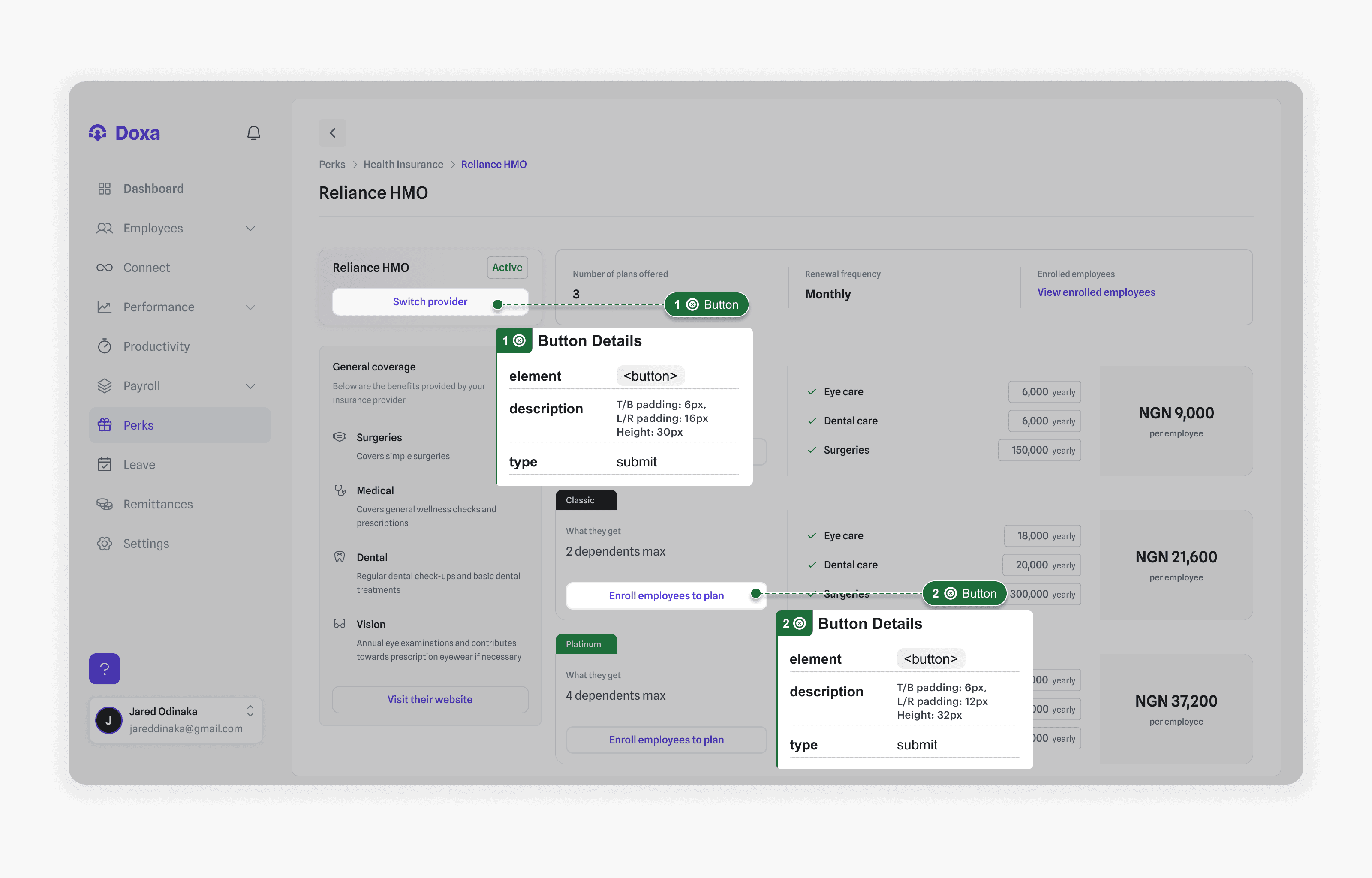
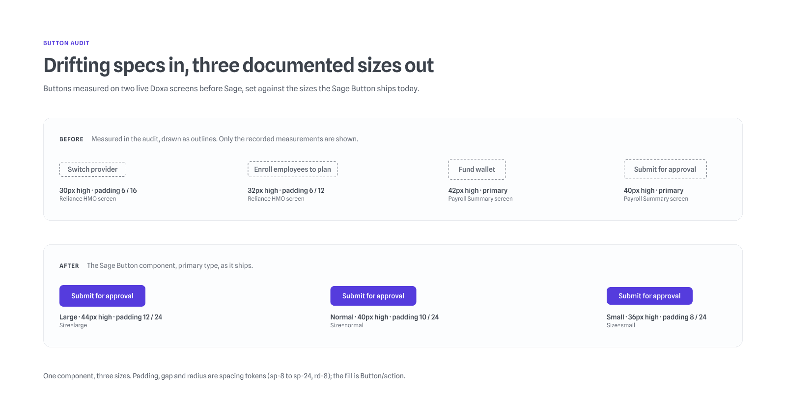
Reliance HMO screen with two buttons annotated: Switch provider at 6px and 16px padding, 30px high; Enroll employees to plan at 6px and 12px padding, 32px high
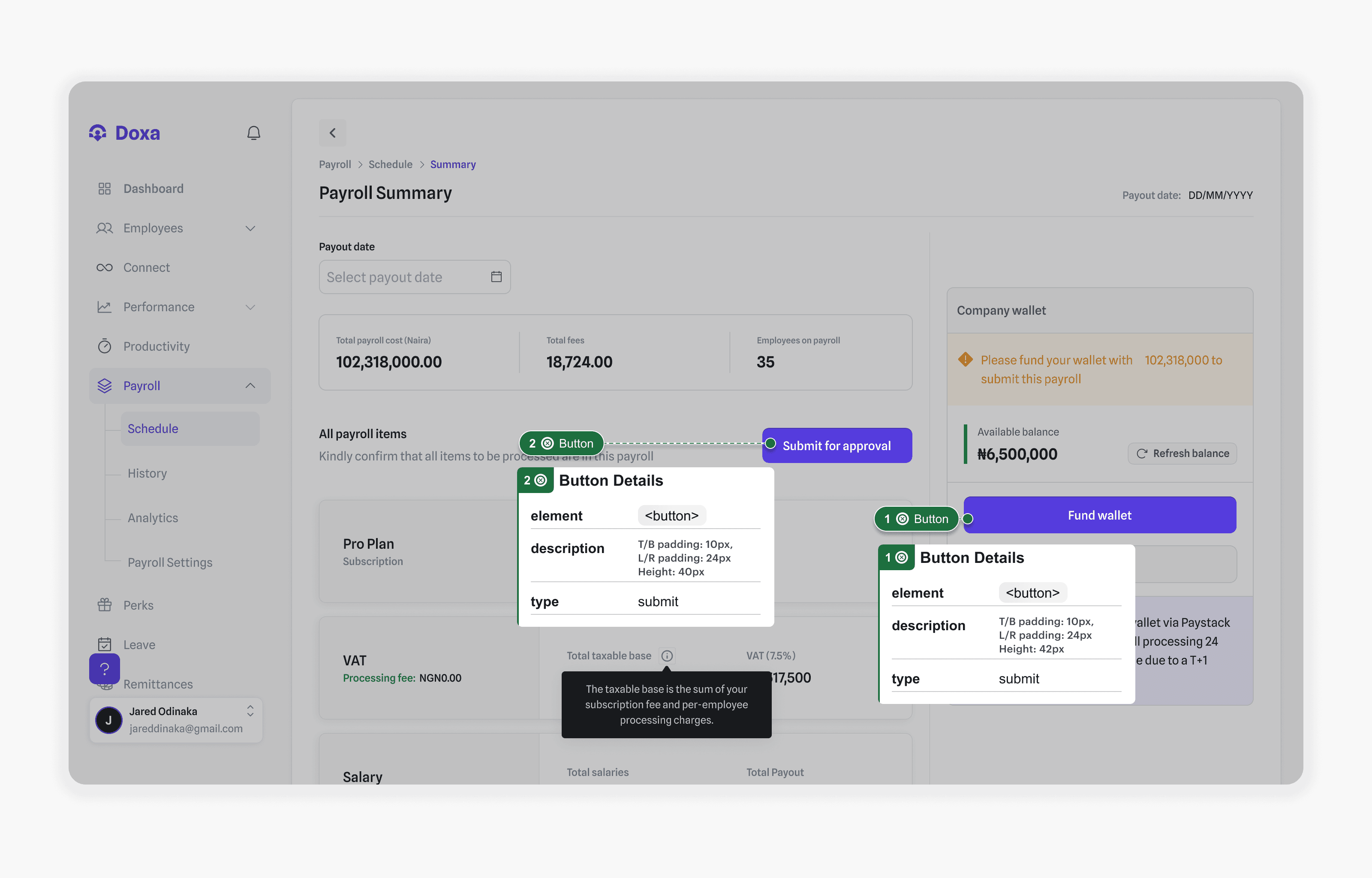
Payroll Summary screen with two primary buttons annotated: Fund wallet at 42px high and Submit for approval at 40px high
01/02Two buttons on one screen, two different specs.

That set the priorities: consolidate, tokenise, document.

“Half my handoff questions were just ‘which purple is this one?’” — Frontend engineer, Payroll team

Decision 1

Three token tiers, named for meaning

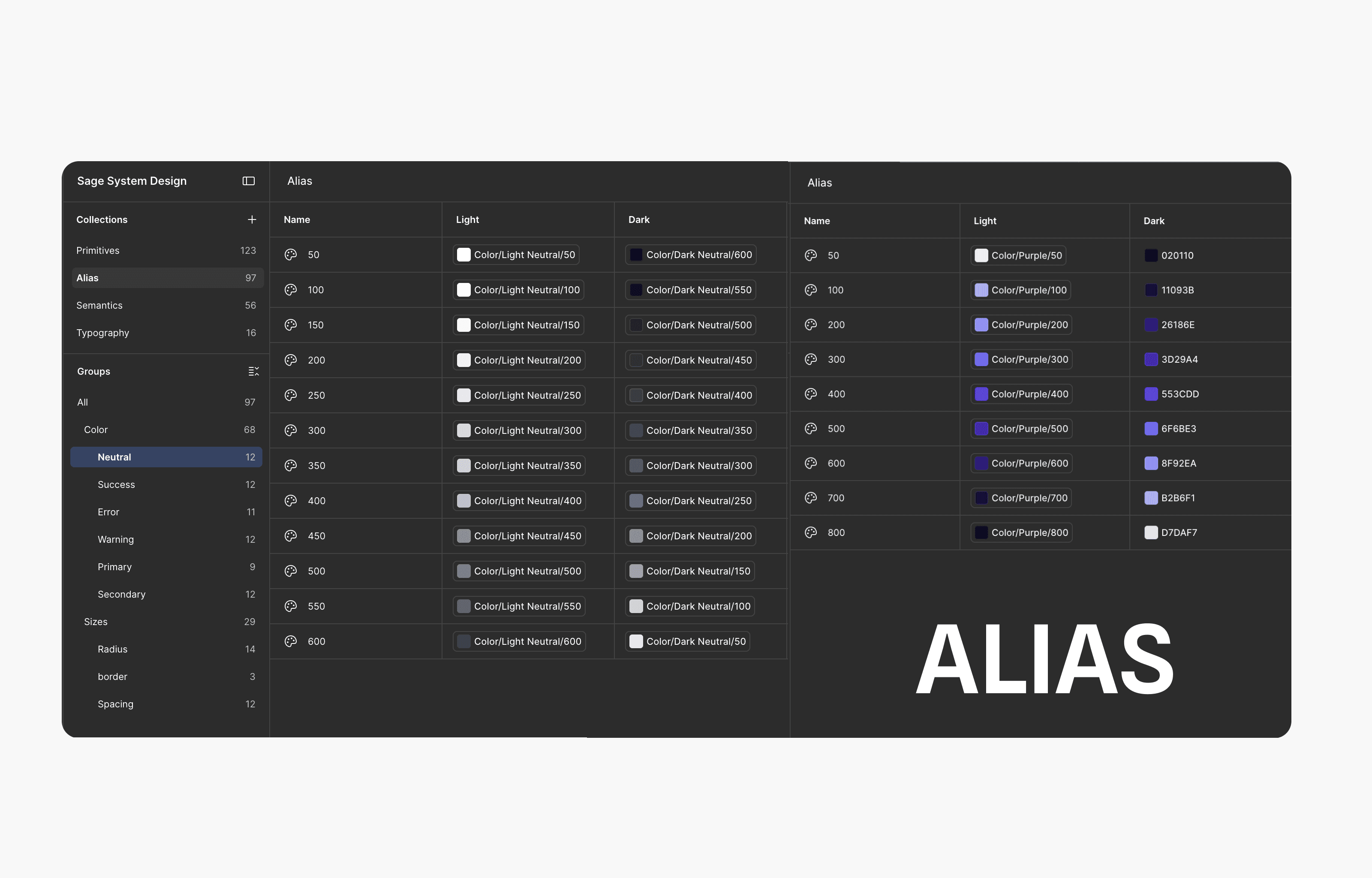
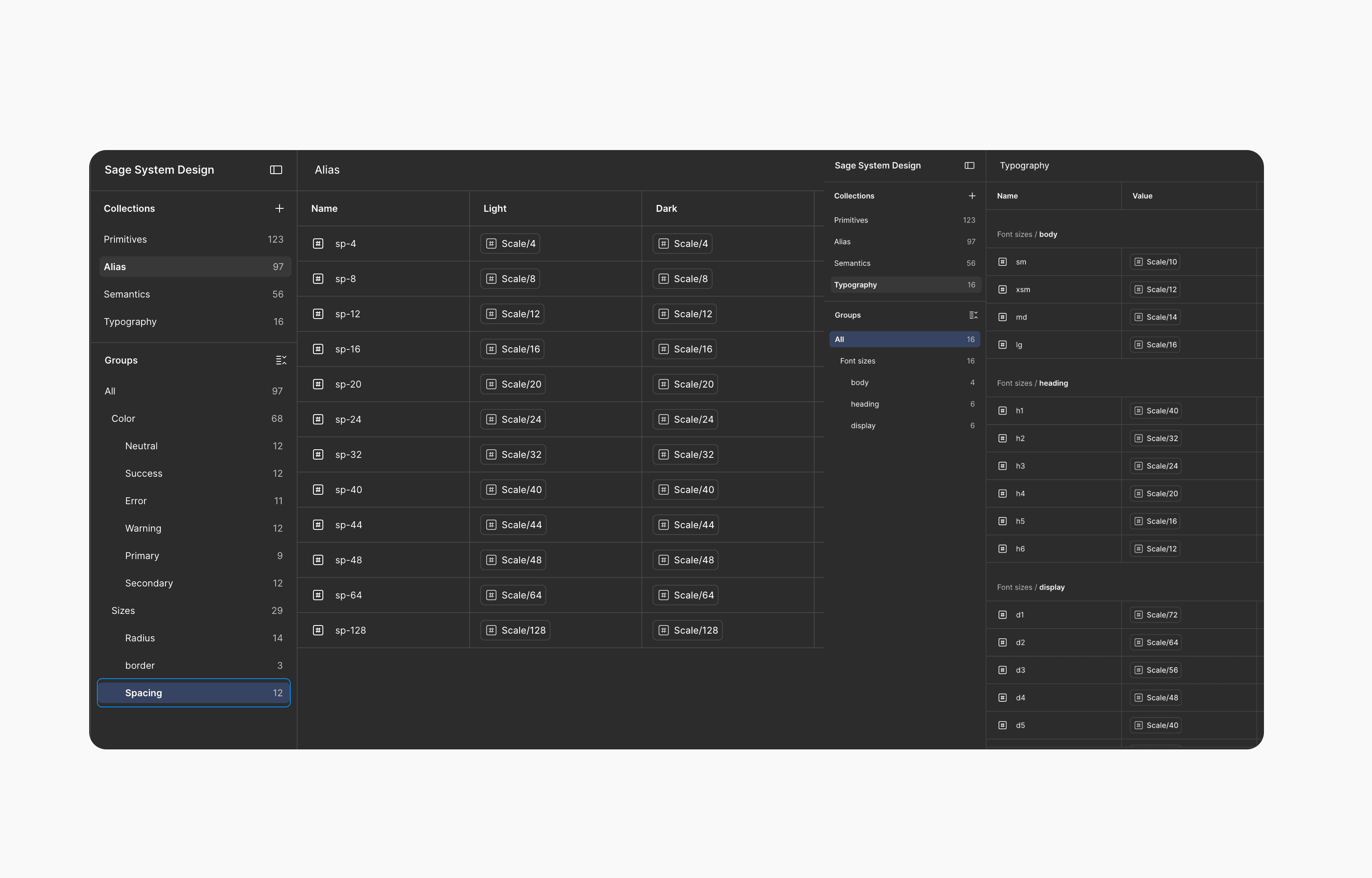
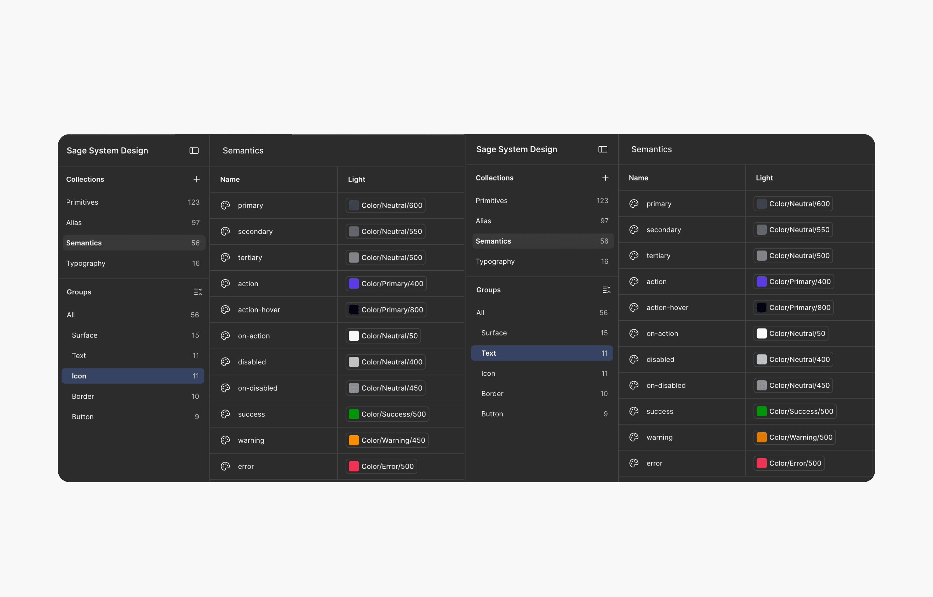
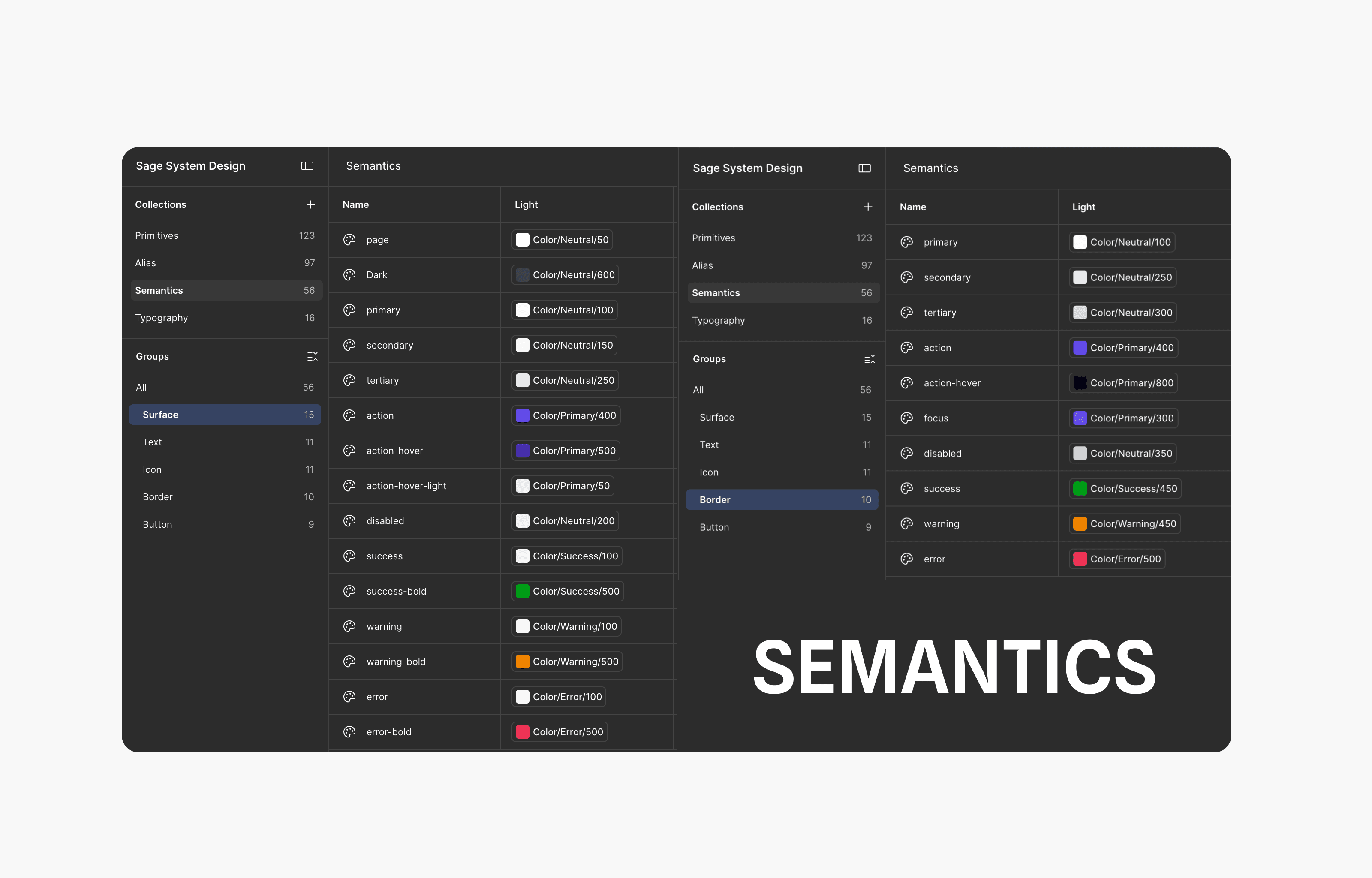
I built the foundations as Figma variables in three tiers: Primitives (131) hold raw values; Alias (126) maps them into scales and carries the light and dark modes; Semantics (84) name what a value is for, grouped by Surface, Text, Icon, Border and Button. Typography (32) covers body, heading and display sizes, and Motion (9) holds the durations, easings, stagger step and spring used for animation.

The naming mattered most. Semantic names like action, not a colour number, let design and engineering speak the same language, and they kept the system maintainable as it grew.
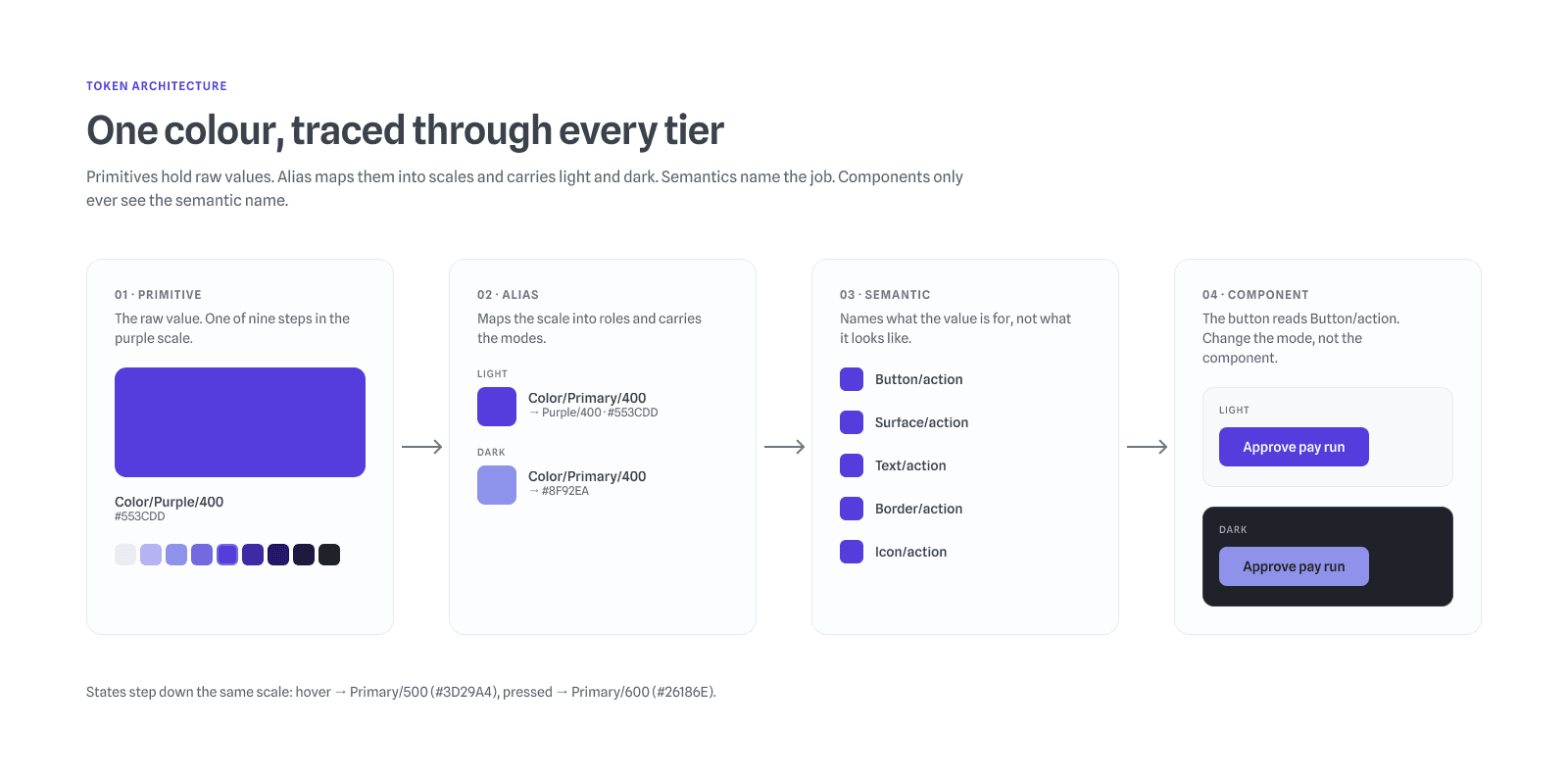
Purple/400 traced through four tiers: the primitive #553CDD, the Alias token Color/Primary/400 (#553CDD in light, #8F92EA in dark), the semantic tokens Button/action, Surface/action, Text/action, Border/action and Icon/action, and a primary button rendered in both modes
Figma variables: Semantics collection with Surface and Border tokens such as page, primary, action, action-hover, disabled, success, warning and error
Figma variables: Alias collection with Neutral and Purple scales in light and dark modes
01/05One colour traced through every tier. Change the mode, not the component.

I considered a single flat palette, which is quicker to set up, but every dark-mode value would have needed its own name, and renaming a colour would have meant touching every screen. Putting modes at the alias tier kept semantic names stable across light and dark, so engineers map a token once and themes switch underneath it.
Decision 2

Fewer buttons, with rules

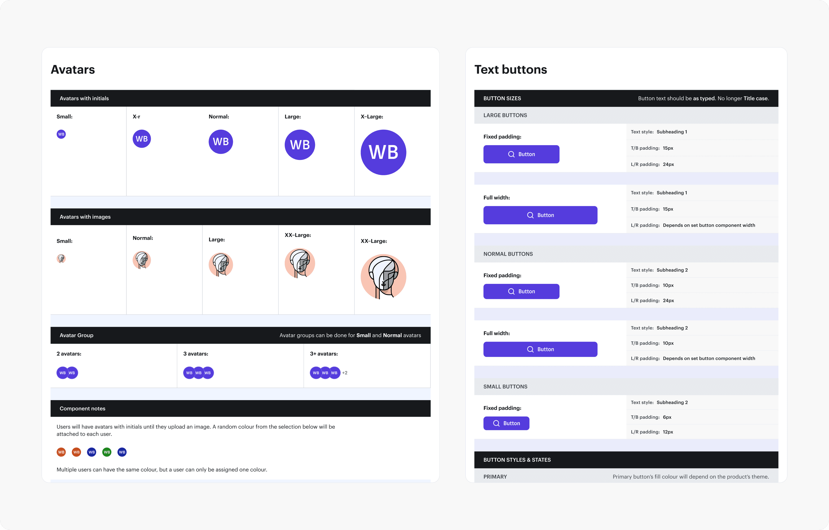
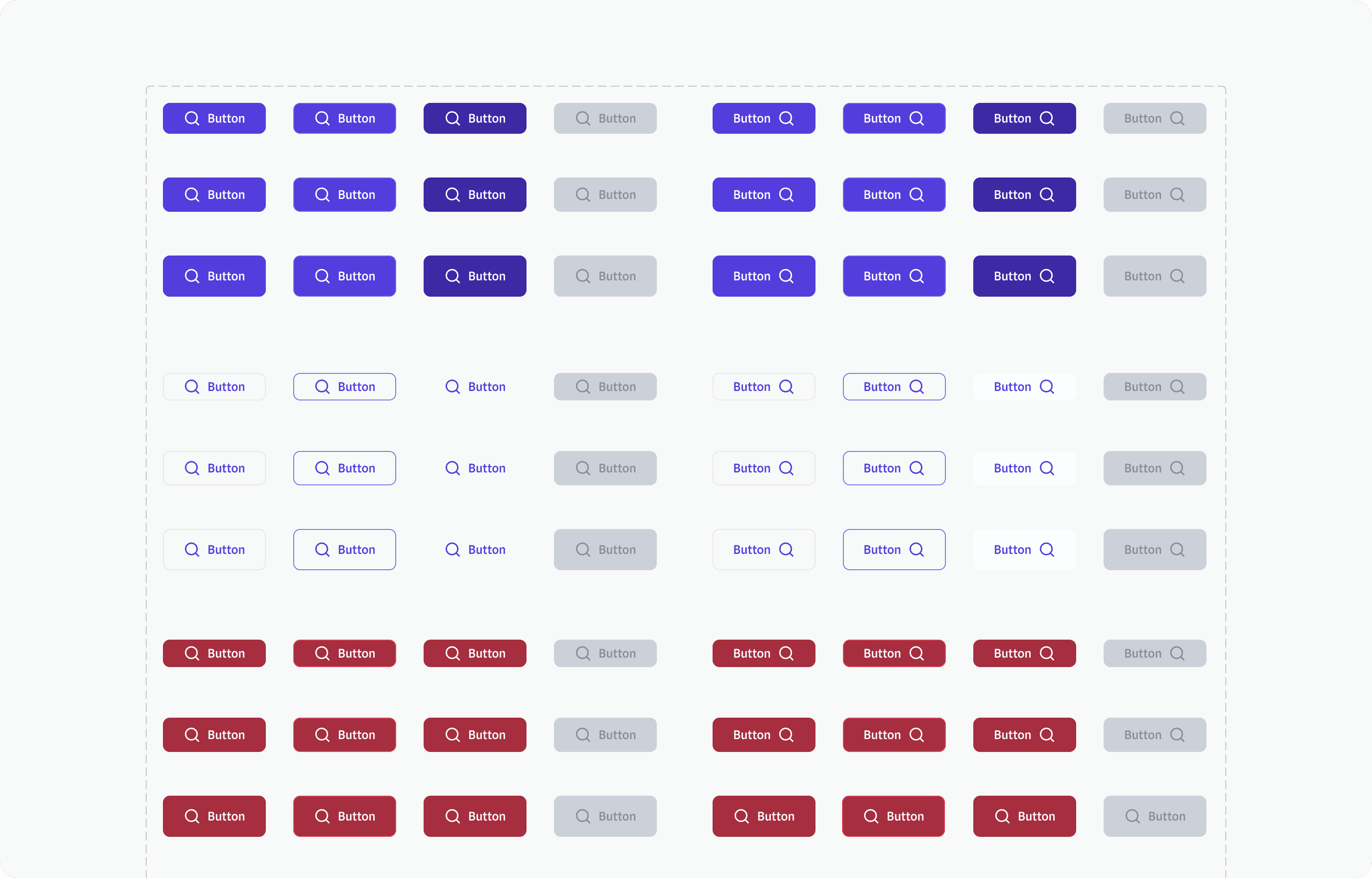
The button library covers primary, secondary and destructive types in three sizes, with icons on either side and default, hover, pressed, focus, disabled and loading states. The documentation fixes the specs the audit found drifting, and every value is a spacing token: large buttons at 12px top and bottom and 24px side padding, normal at 10px and 24px, small at 8px and 24px. It also sets usage rules, for example “Button text should be as typed. No longer Title case.”

Four buttons measured in the audit, 30, 32, 42 and 40px high with mismatched padding, above the three Sage button sizes: large 44px with 12/24 padding, normal 40px with 10/24, small 36px with 8/24
Button variant sheet: primary, secondary and destructive buttons in three sizes, with icons left and right, in default, hover, pressed and disabled states
Text buttons documentation listing padding and text style for large, normal and small buttons, fixed and full width
01/07One button, four layers, every value a token.

With a 20px line height, 12px, 10px and 8px of vertical padding give large, normal and small buttons exact heights of 44px, 40px and 36px.

Decision 3

Document how to use it, not just what it is

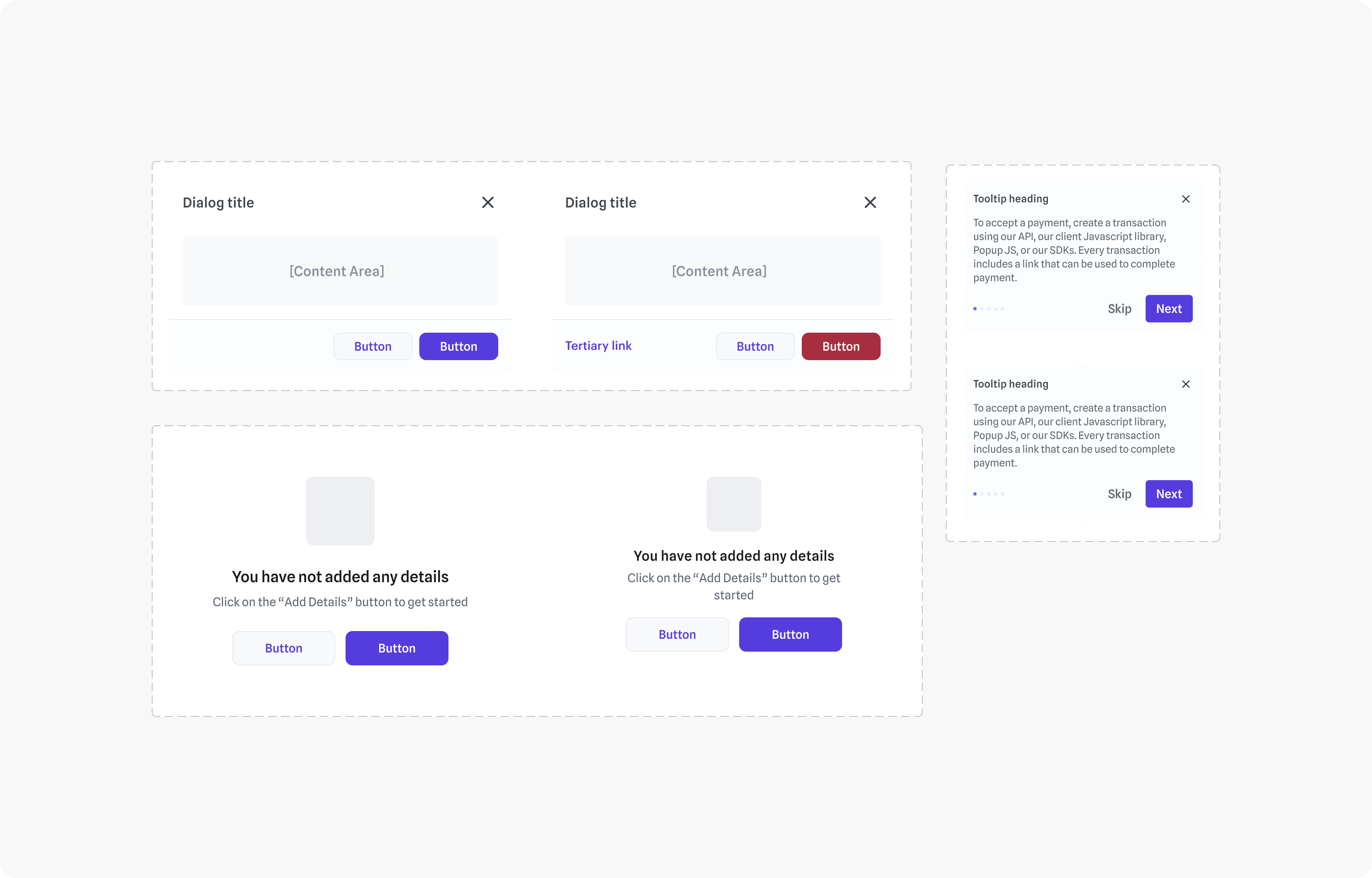
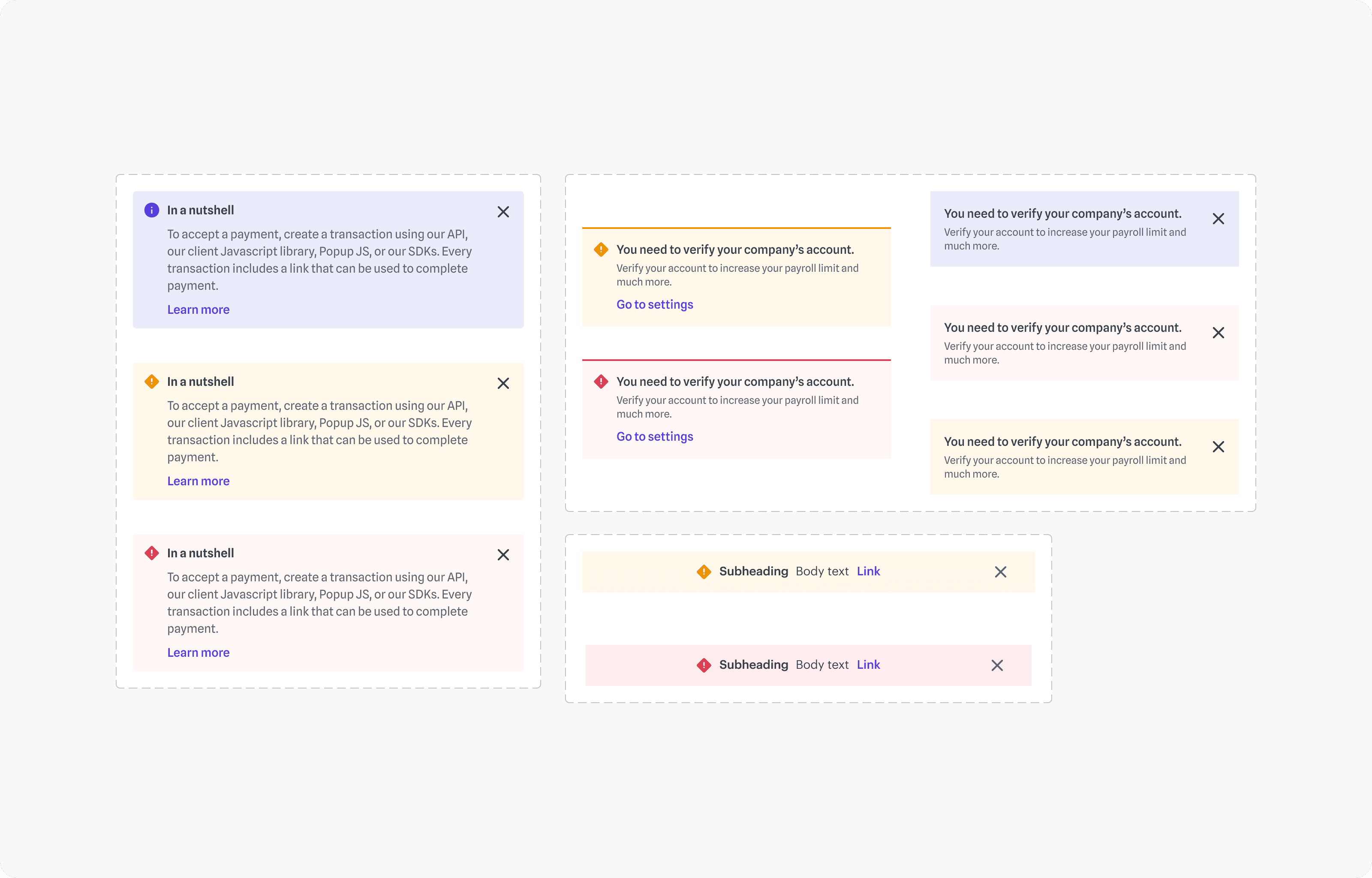
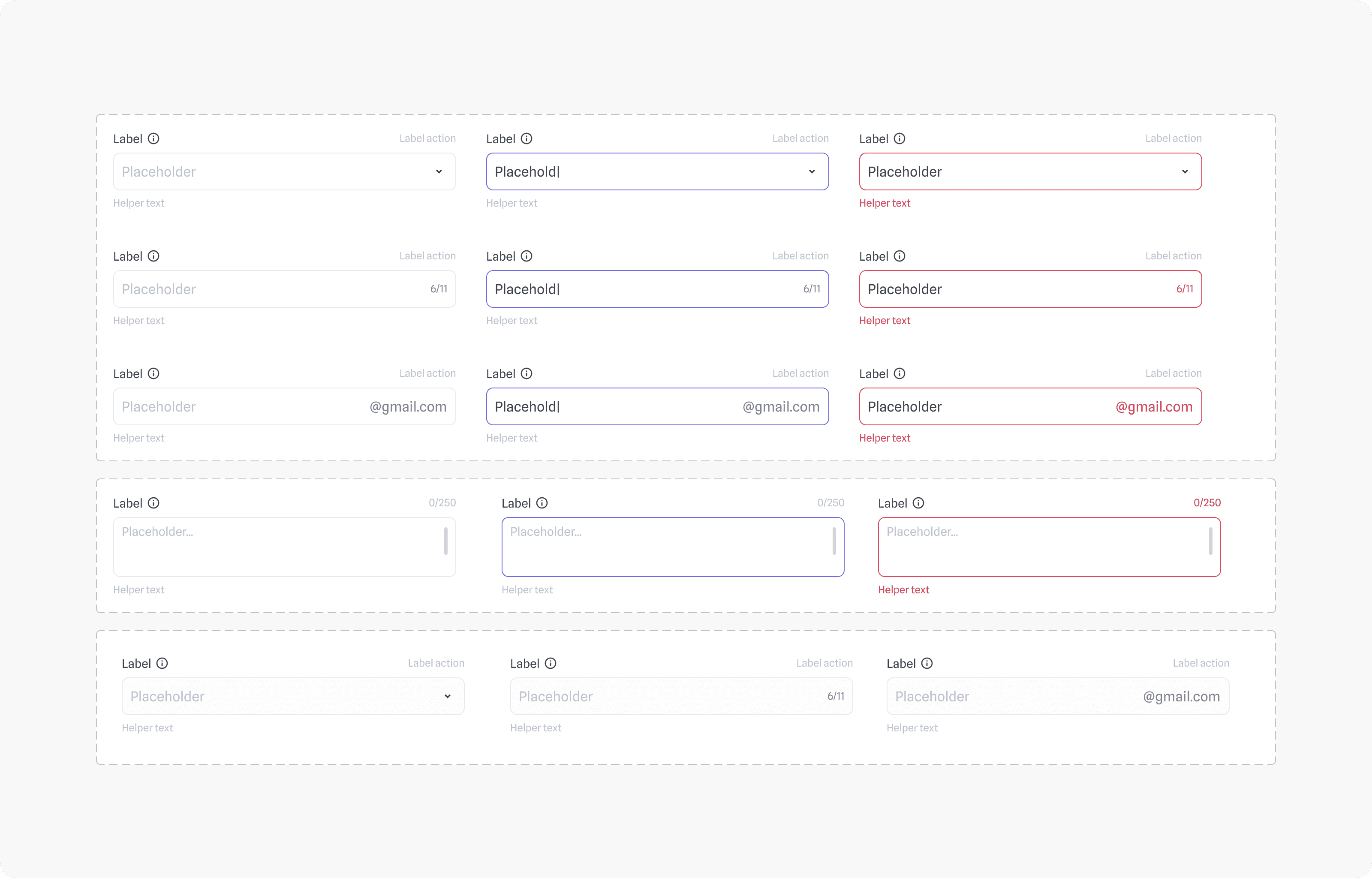
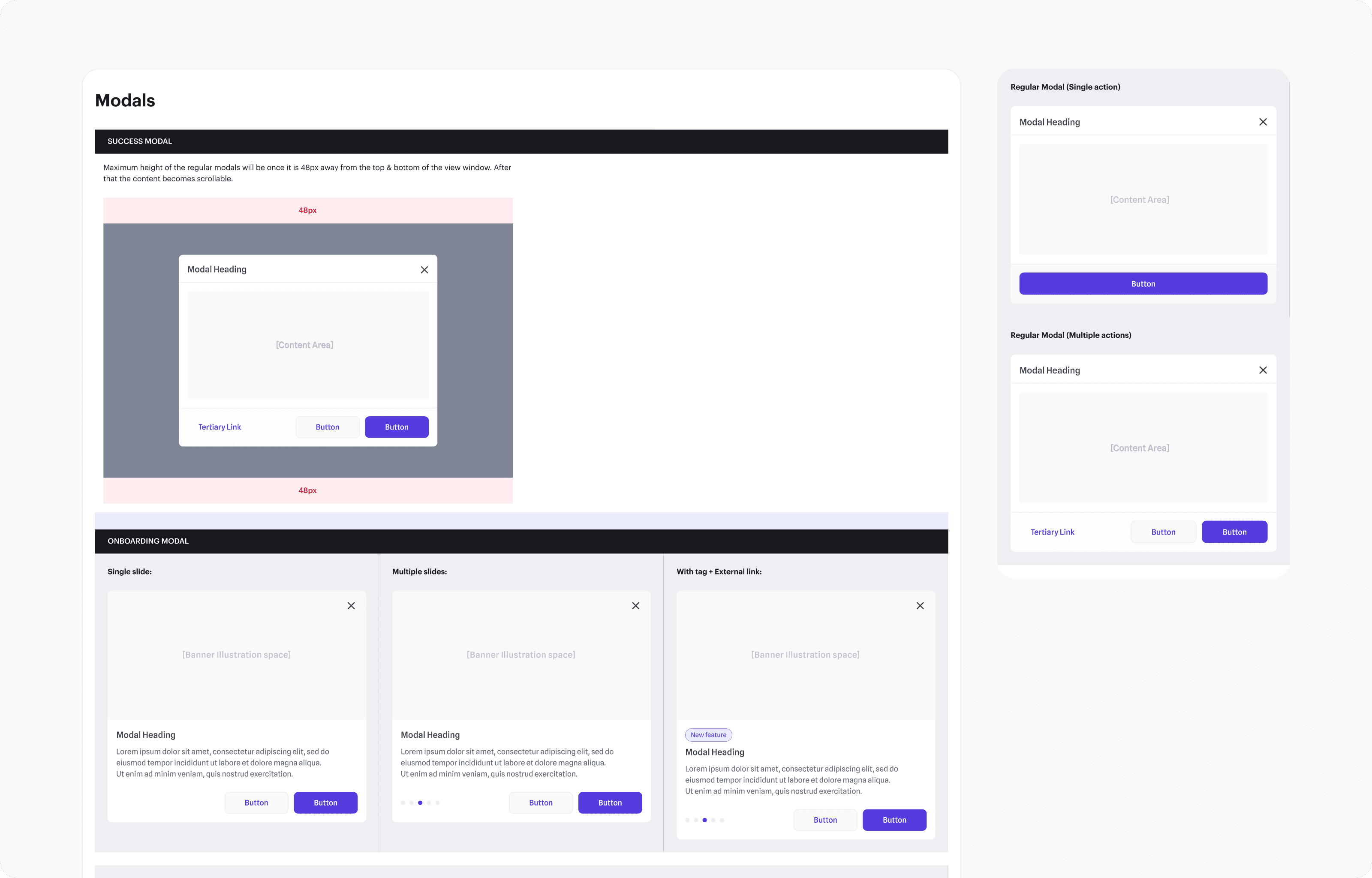
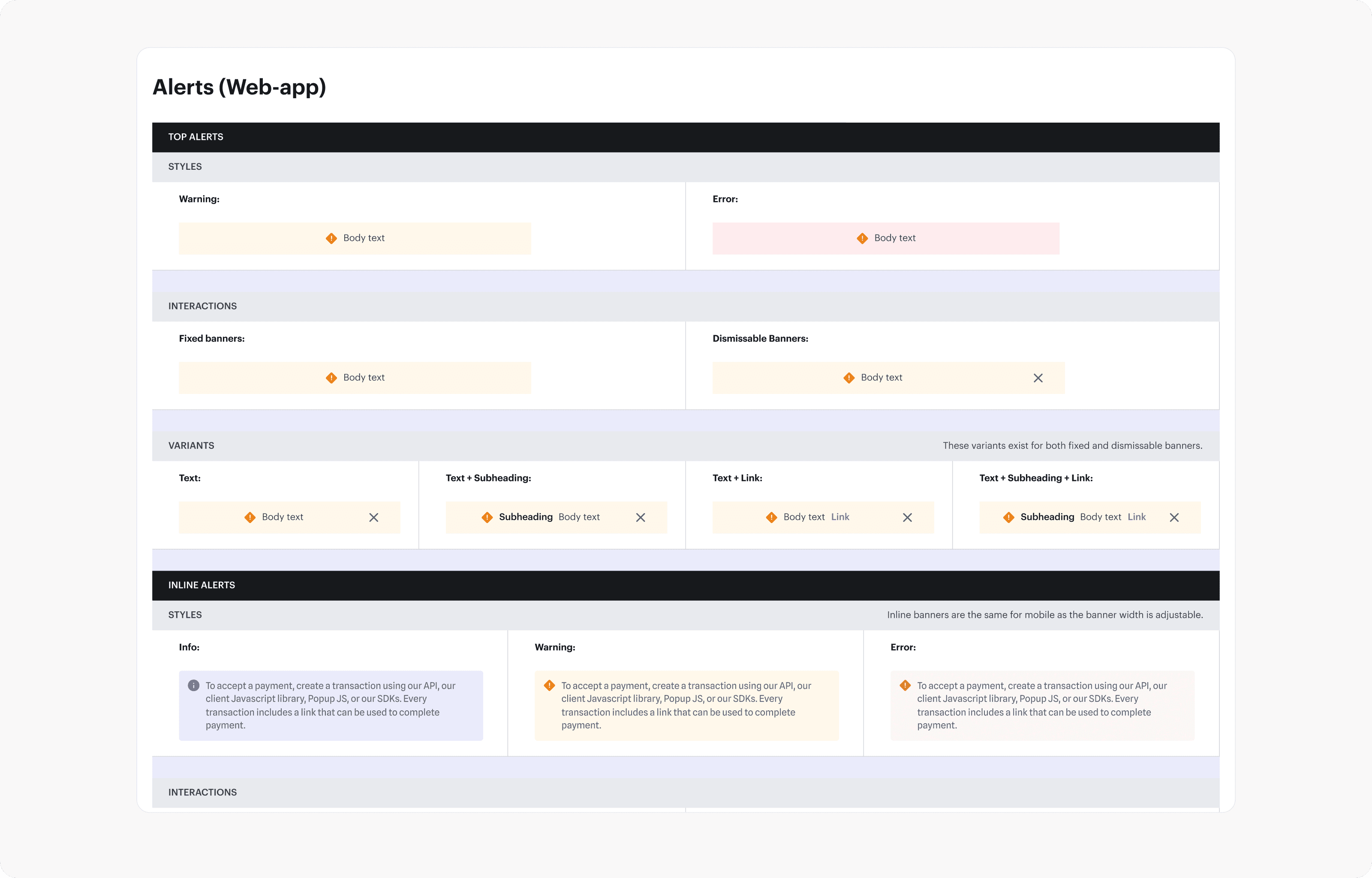
Components alone don’t guarantee good UI. People have to use them correctly, so every component came with usage notes and behaviour rules. Modals stop growing 48px from the top and bottom of the window and then scroll; banners come in fixed and dismissable versions; inputs document default, focus, error and disabled states with helper text.

Input sheet: select, text with counter, text with suffix and textarea in default, focus, error and disabled states
Modals documentation showing the 48px maximum height rule and single action, multiple action and onboarding modals
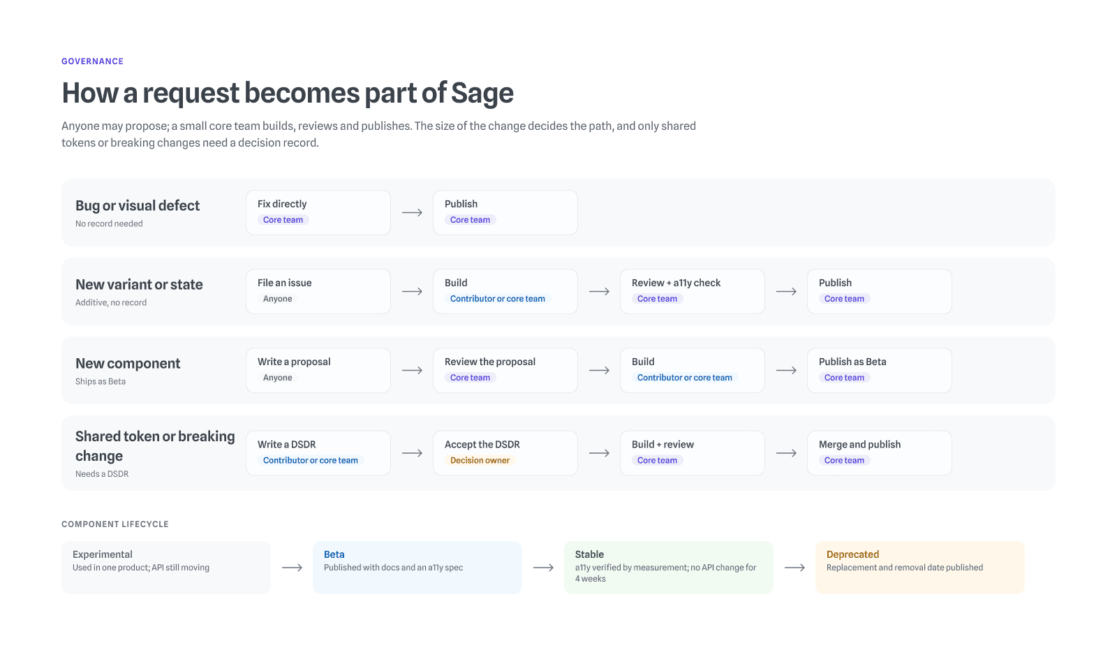
Four change paths into Sage: a bug fix goes straight to the core team; a new variant or state is filed, built, reviewed with an accessibility check and published; a new component is proposed, reviewed, built and published as Beta; a shared token or breaking change needs a decision record accepted by the decision owner. Below, the lifecycle from Experimental to Beta, Stable and Deprecated
01/04Inputs with every state documented.

To stop the system sprawling back, I set up a contribution path. A team that needs something new raises a request with its use case; we first check whether an existing component covers it; if not, a designer drafts it in a branch of the library, an engineer reviews it for feasibility, and it ships with documentation in the next fortnightly release. I made the final call on what entered the library.

04/Result

The result

Handoff

Cut in handoff time per feature, from about 5 working days to 3, across 12 features tracked over two quarters

40%
Library

Reusable components, replacing one-off variants

80+
Adoption

Of new screens in the two quarters after launch built from library components

85%
Consistency
One experience across Payroll, Productivity, Performance and Recognition, confirmed by a re-audit of 60 screens six months on

05/Learnings

What I learned, and what I’d do differently

  1. 01

    A system is only as good as its adoption

    The components were the easy part. What made the system actually used was naming things clearly and documenting how and when to use them.

  2. 02

    Tokens are a shared language, not a colour palette

    Semantic naming is what let design and engineering finally speak the same language.

  3. 03

    Govern from the start

    Deciding early who could add to the system, and how, kept it from sprawling back into the chaos it was built to fix.

  4. 04

    What I’d do differently: test contrast at the token level

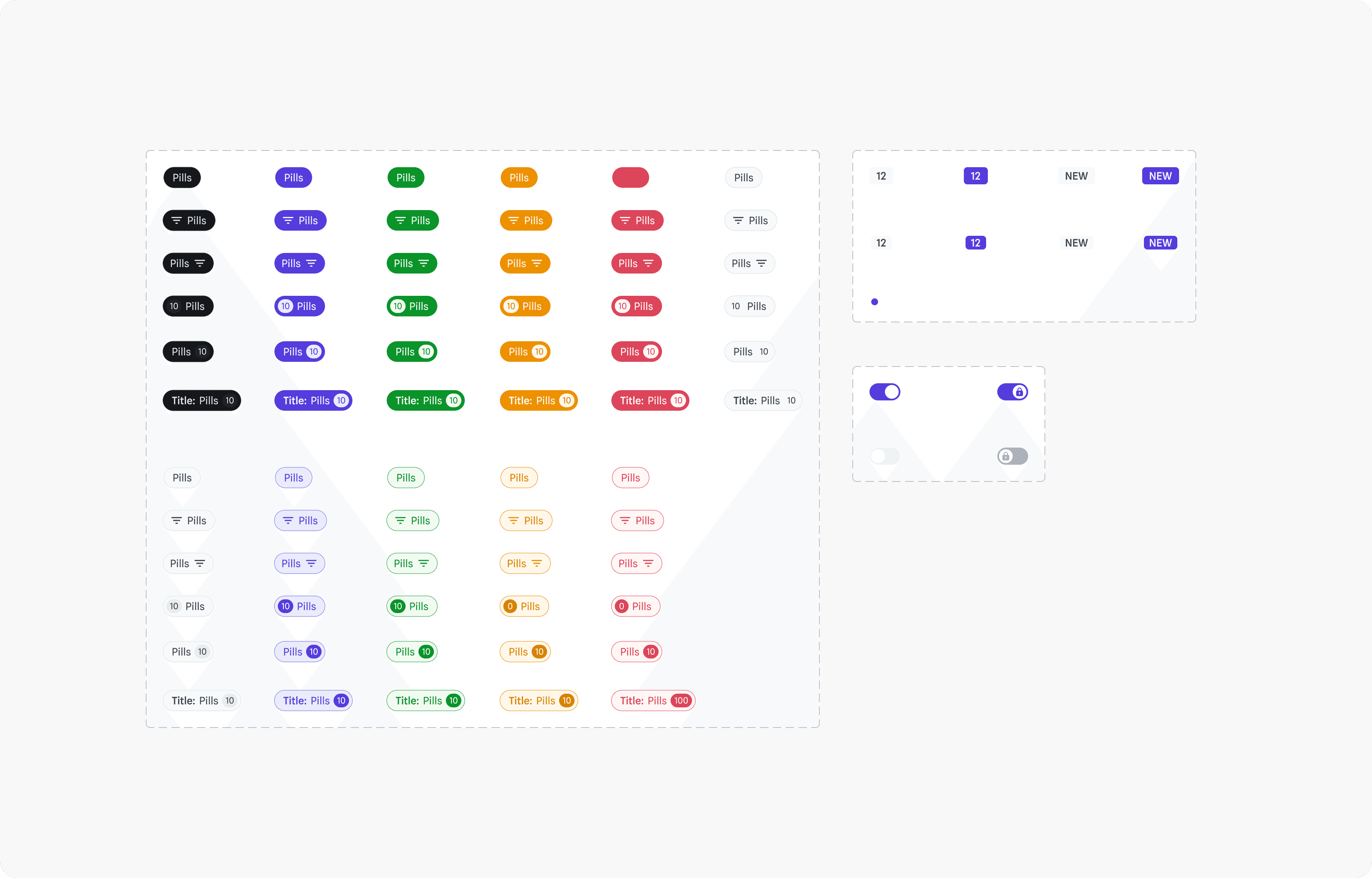
    I checked contrast screen by screen after the components were built, which is how low-contrast placeholder text and amber pills slipped through. Next time I’d validate every text-on-surface pair as tokens, before a single component uses them.

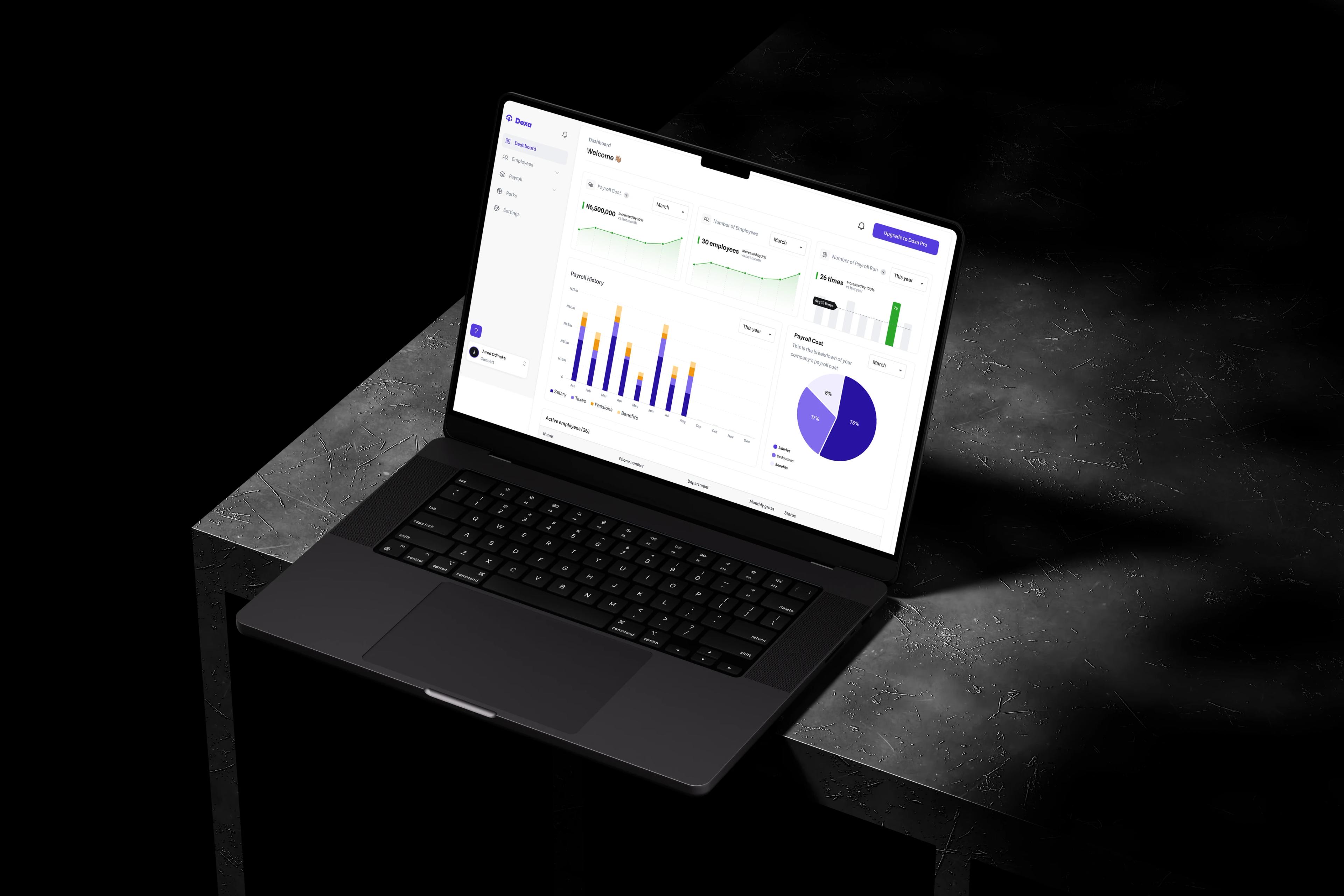
DOXA preview